Brand Revamp
Client: African Scholars’ Fund
Brief: Take our dated brand and breathe fresh life into it. Blow us away with your concept!
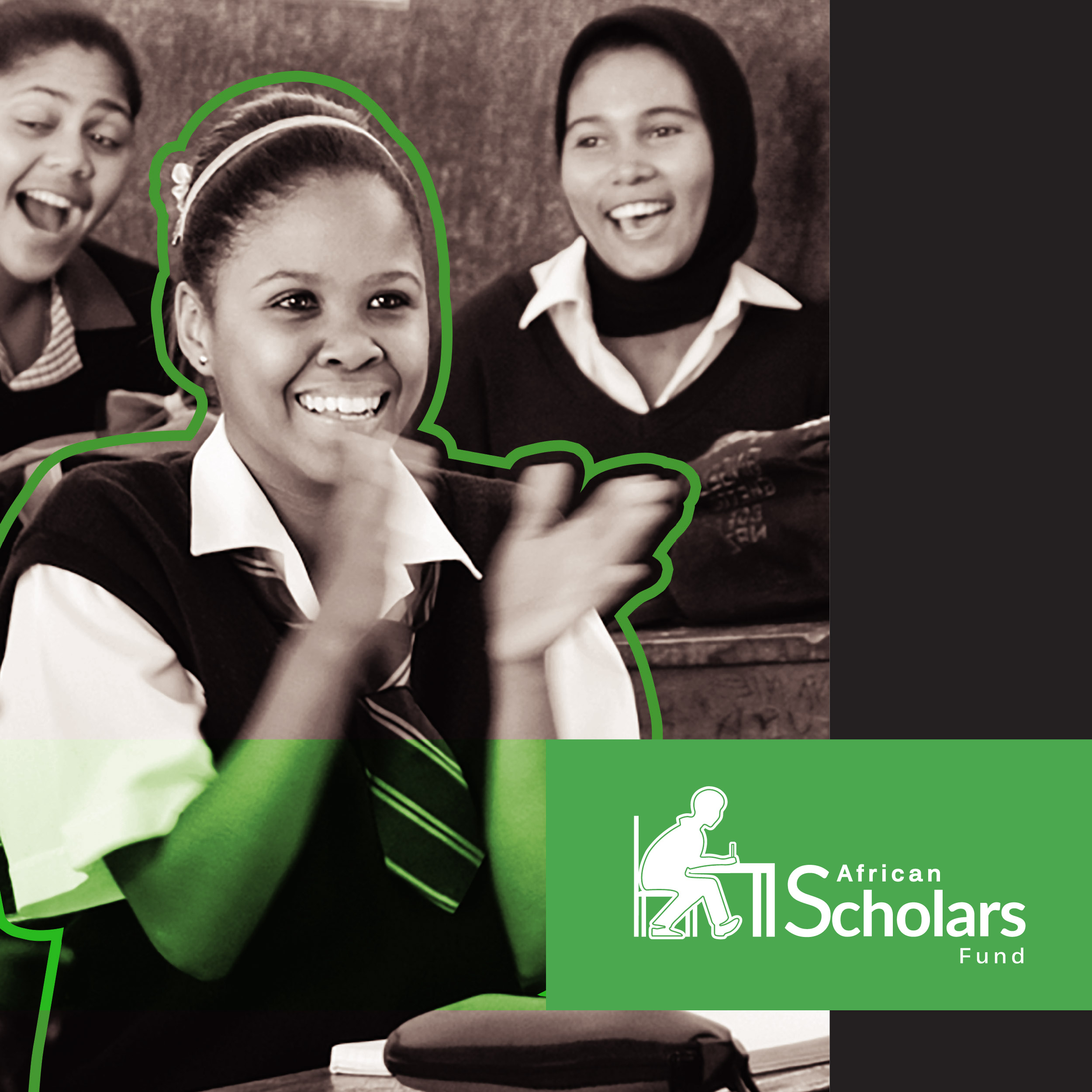
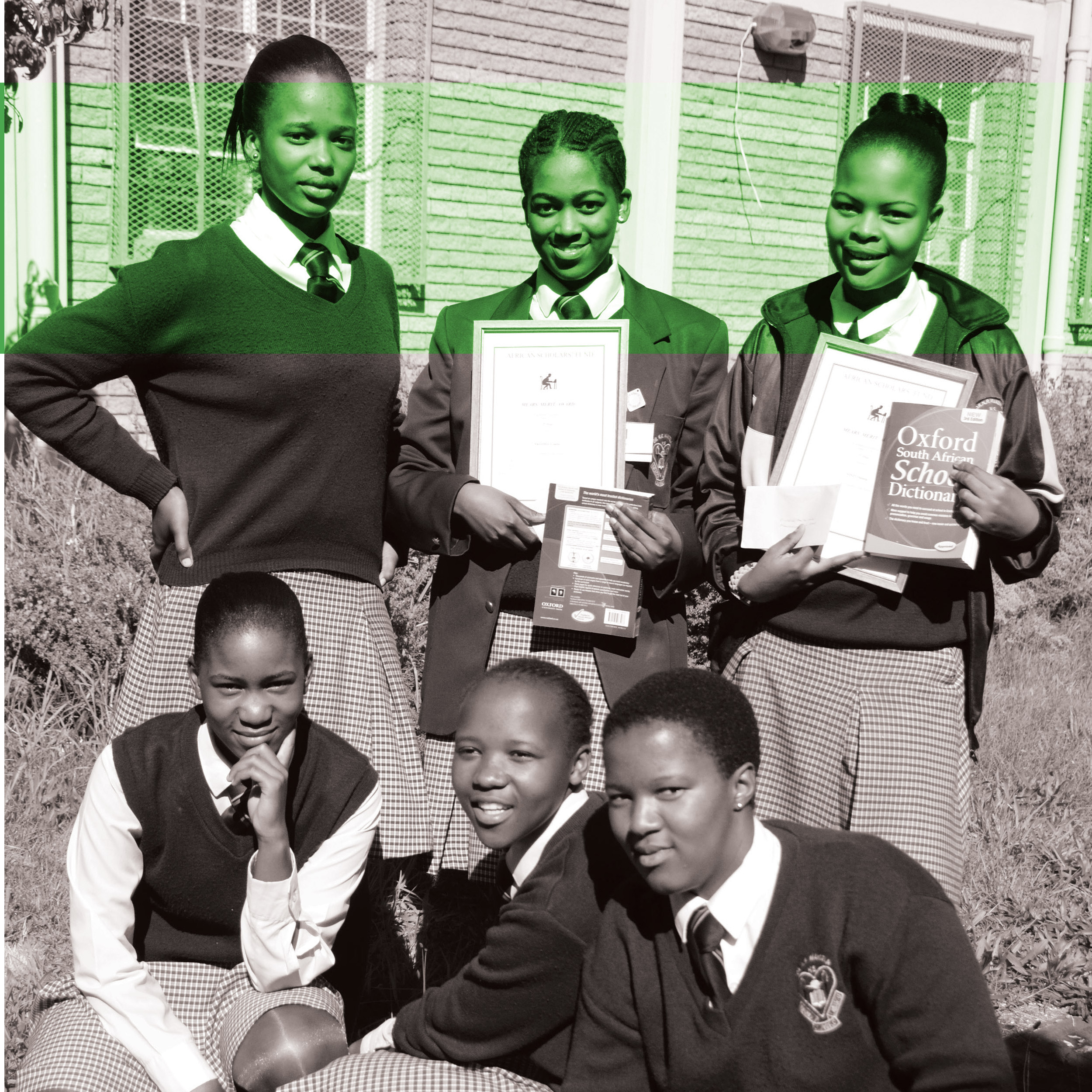
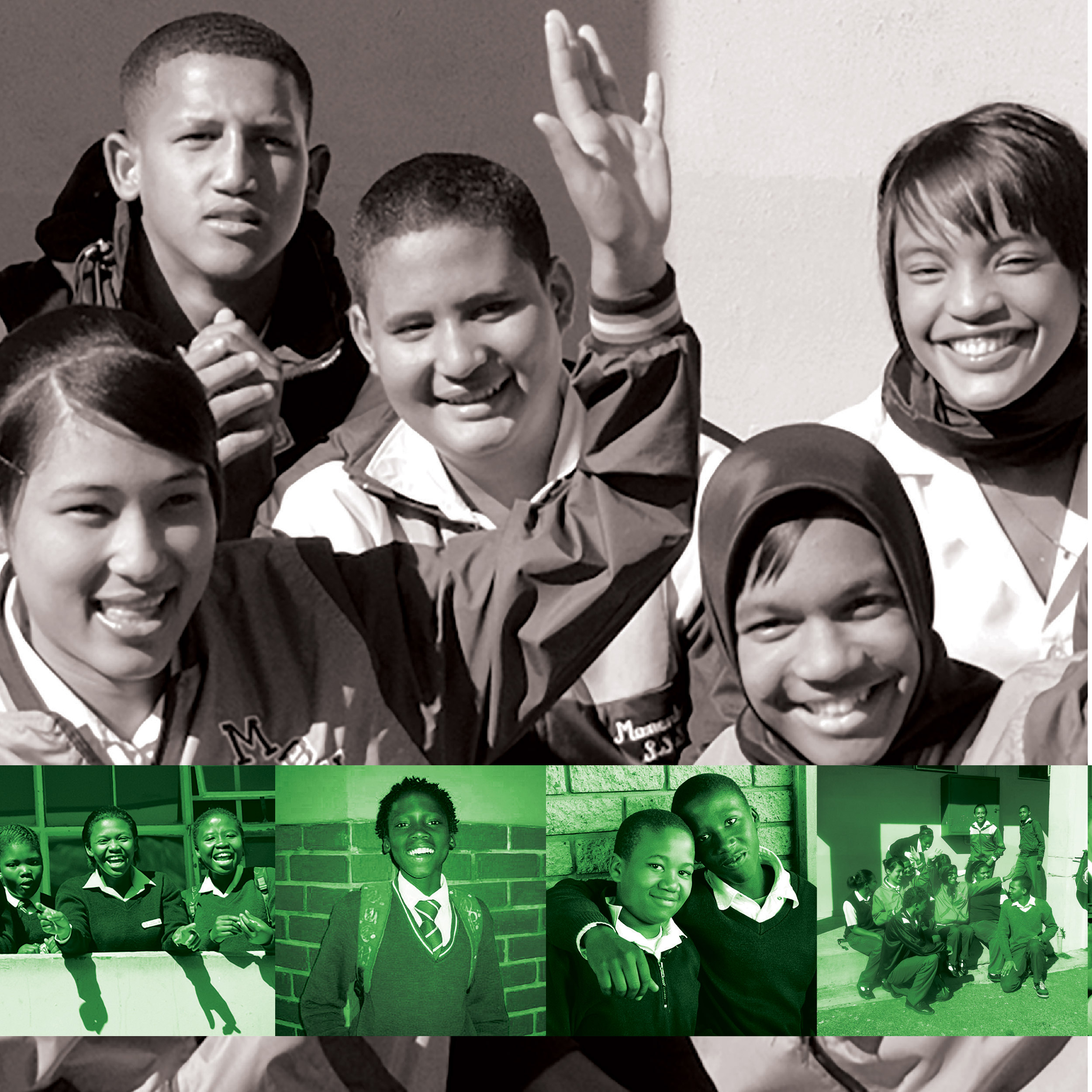
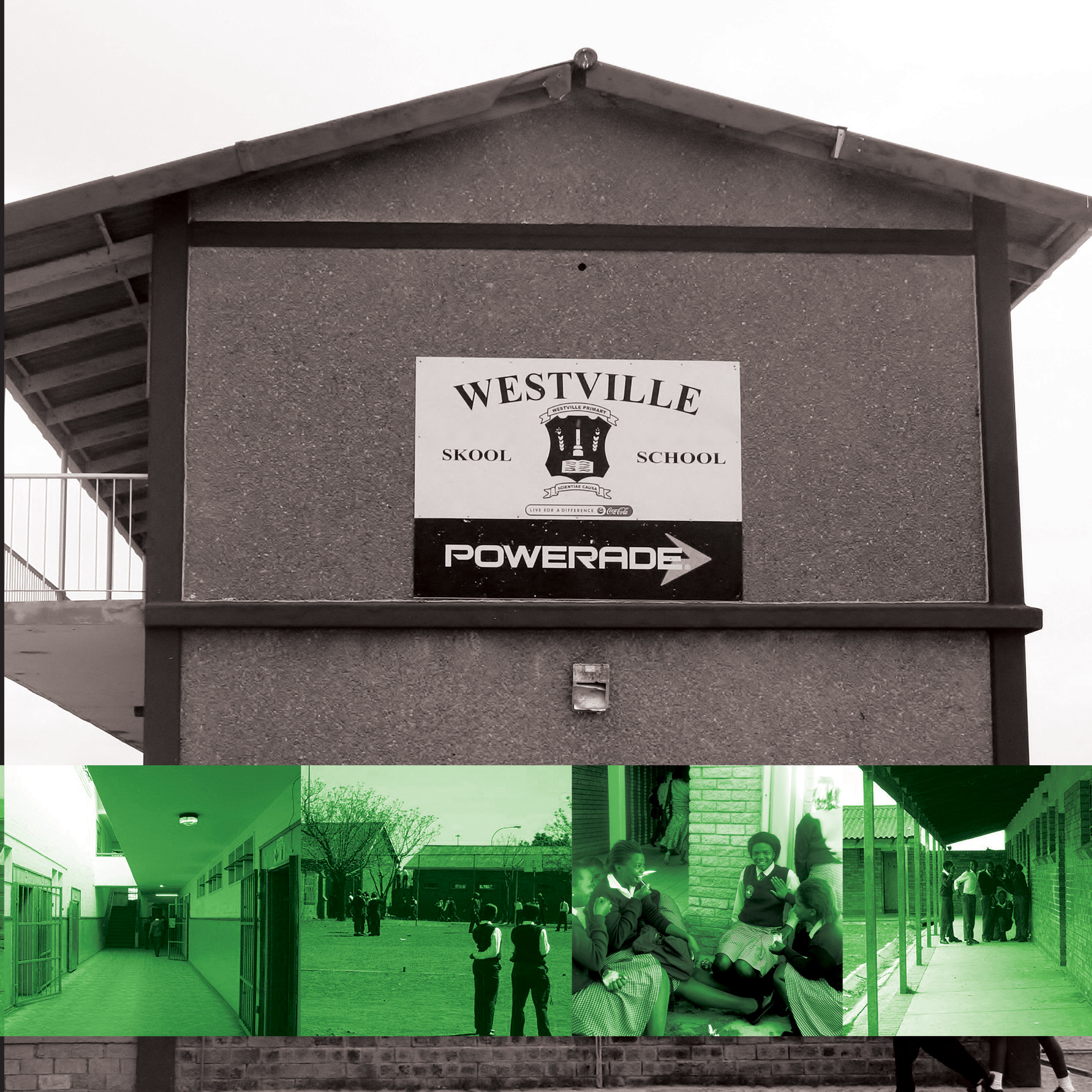
Solution: We first spent time with the client (their staff and their board) and examined the essence of what they do. We asked critical questions and conducted a competitor analysis in conjunction with a positioning mapping exercise. We examined the colour psychology based on their essence, which was to nature young talent to achieve their full potential. We decided to keep the profile, but modernise it into a gender-neutral, slick African design. The green line would become an integral part of their brand identity system, and it indicates that this child is now covered by the African Scholars’ Fund. The green also indicates a notion of nurturing, mentoring and protecting this child until they are stable and contributing members of society. The brand identity needed to flow through all the components of the organisation, especially the website and fundraising efforts. We designed the corporate brochure and a new website showing real photos of children who are thriving in the African Scholars’ Fund.